Wednesday, November 14, 2012

Recent Hasselblad Developments

 big brother Brendan - Kodak Portra 400
the younger and less groomed sibling - Kodak Portra 400
my crossing. Koshinzuka Sation, Toshima-ku, Tokyo - Fuji 160NS
carpenters workshop, Kyoto - Kodak Portra 400
Cez, carpenters workshop, Kyoto - Kodak Portra 400
Takoyaki Chef, Gion Matsuri, Kyoto - Kodak Portra 400
Local resident of the Philosophers path, Kyoto - Fuji 160NS
Tadao Ando, Garden of Fine Arts, Kyoto, 2004 - Kodak Portra 400
Tadao Ando, Garden of Fine Arts, Kyoto, 2004  - Kodak Portra 400
Moriyama House, Ryue Nishizawa, Ota-ku,Tokyo, 2005 - Fuji 160NS
Moriyama House, Ryue Nishizawa, Ota-ku,Tokyo, 2005 - Fuji 160NS
Moriyama House, Ryue Nishizawa, Ota-kuTokyo, 2005 - Fuji 160NS

Wednesday, October 10, 2012

Dereb from Ethiopia

Pakistan Karakoram Himalaya . Hasselblad

Phil, a dear mate of mine, and I recently journeyed into the Pakistan Karakoram Himalaya. Phil, like a legend, took his demon Hasselblad along and here are some of our favourite shots that he took.


...


Monday, September 10, 2012

Monaco . Kengo Kuma Laboratory Project


Recently, I was privileged to have Monaco project in which I was team member of exhibited at Design Life Bangkok - an RMIT graduate Alumni exhibition. I have been meaning to get my work together for while but I seem to quite easily find others things to occupy my time on - like the next project. Nevertheless, here is the text and images that was displayed at the exhibition.

Project
This is a proposal for 12 boutique apartments, penthouse and mixed use commercial in the illustrious Monte Carlo, Monaco. The 1000m2 site sits directly adjacent to the Monte Carlo Casino Gardens providing sweeping south facing views of the Monte Carlo Casino and Mediterranean Sea. The extruded volume is carefully twisted, tapered and pulled, directing the buildings energy towards this main view. Juxtaposed against the context of heritage Beaux Arts, Mediterranean influenced and late 20th century in situ concrete buildings, timber louvers and triangulated glass panels are used to carefully articulate the volumes movement and operate with varied planes of transparency based on privacy needs and admission of light. Each apartment has equal north views onto Boulevard des Moulins and South facing views towards the park and ocean. A reinterpreted fishbone plan was adopted to achieve this which therefore created dynamic internal and external spaces. The plan is separated into night and day zones with the focus on the living, dining and main terrace to be spatially generous and awash with ambient light. Linked by a passageway and restaurant terrace, the ground level lobby, mezzanine office space and first level retail areas are accessed on both Boulevard des Moulins and Avenue de la Madone. 

Practice

Kengo Kuma and Associates, in association with the Kuma Laboratory at the University of Tokyo is a large scale practice involving more than 150 personnel. Kuma founded his Tokyo based practice in 1990 before establishing his Paris branch in 2008. With over 60 projects on the go around the world, Kuma rarely takes a day off in his quest of sensitive architectural perfection “for architects, perfection is necessary” (CNN). Through his early experiences with Japanese craftsman in the countryside, Kuma applies traditional materials and sentiment to contemporary design problems – often resulting in delicate, textural and multilayered works that harmoniously respond to the atmosphere of its place. 


Professor Kengo Kuma and Associate Professors Ko Nakamura and Mikako Koike headed up the Monaco project team which consisted of Bojan Koncarevic, Tomoyo Sakane, Nikola Nikolovski, Chen Yao and myself as an intern. Over a two month period we all worked through an intense design process involving many digital and analogue processes. I was personally responsible for the fundamental apartment planning and later devised the twisting concept for the form.


Thursday, July 5, 2012

Ikebukuro Ramen

Cezar and I retreated from the rain the other day, finding ourselves mercilessly surrendering at the hands of Ramen ninjas and their fine bowls of oily goodness.


Tuesday, July 3, 2012

Ethio Jazz . Samuel Yirga

I have been sessioning the supremely talented Samuel Yirga for the last few months.


Afro Spectacular


Thursday, June 14, 2012

SPATIAL DESIGN STUDIO . SHARE yaraicho openhouse

I recently attended the open house of Spatial Design Studio’s (Satako Shinohara) fresh new domestic project, SHARE Yaraicho. The visit to the poignant work triggered quite the curiosity from the days many visitors.

‘SHARE Yaraicho’ (which I will refer to as ‘Share’) is located within the narrow streets of Yaraicho, Shinjuku, Tokyo. Set amongst third and fourth generation detached homes, the environment is consistent with many affluent niche areas of Tokyo. These are characterised by well-manicured and larger dwellings, nonetheless humble, homely and formally idiosyncratic. Within this commonplace context the envelope dimensions are respectful with its neighbors, however unique through its simple form and innovative use of anomalous fabric. Share fuses sympathetic obtrusiveness with playful ambiguity: It is simultaneously modest but conceptually bold.

After following the GPS trajectory, one steps of the main road and wanders up a slight hill. The form appears abruptly one lot in from the corner and set back three metres from the curbside. Naturally, the visitors to the invited opening congregate on the street to smile and point at the street façade. What stands before us is a carefully choreographed rectangle volume of which is framed by deep and perpendicular galvanized plates. The composition is asymmetrically weighted by a window positioned in both the bottom left hand corner at street level and another in the diagonally opposite top right hand corner. The majority of the façade is a semi-transparent polymer membrane which subtly reveals the human movement within. This use of an anomalous fabric is a common thread in the studios work through projects such as the recent Maglia Jiyugaoka. The membrane is breached by two unzipped triangular openings, one being the main entry at the right hand ground level and the other being small and ambiguously perched above the ground level window. These openings, given the nature of the material, furthermore reveal the curiously complex interior and facilitate eye contact with the internal residents. This could foster voyeuristic pedestrian/resident visual contact. The membrane is detailed an industrial and somewhat temporary manner through the use of large plastic zips, post-tensioned steel bracing, and a thick white rope that stitches the fabric to the galvanized steel frame. This raw aesthetic is carefully adopted throughout the interior.

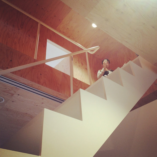
Upon stepping through the main opening, one enters a four story internal atrium that is awash with light emitted through the semi-transparent membrane. Your eyes are instinctively drawn up to the angled polycarbonate enclosure that sits isolated by a 500mm gap above the first floor volumes. People on the second and third levels poke their heads through the hinged openings to gawk down on those who enter. Users can exit the volume onto the top of the ground floor dorm volume overlooking the entrance space. At your feet, the continuation of the concrete floor surface from outside suggests you have entered an exaggerated doma. Ahead is a glazed stairwell running width-ways that reflects the both you and street activity through the main opening behind you. The stairwell vaguely obstructs the view to the back alleyway entrance gap and foregrounding sitting area platform. Furthermore, to the immediate left a white and seemingly diagonally positioned volume containing two resident dorms (A & B) that draws your eye to this back entrance and small table. Behind the staircase to the right is another volume encompassing the shower, toilet and washing utilities. Carrying on with the industrial aesthetic, the utility volume is clad in 9mm ply (the visible factory stamp states this) as are the side walls and ceiling of the full height atrium. The glowing light, palpable textures, crisp volumes and atriums generous size is indulgent and liberating– one has entered a cathedral for hip-urban share house living.  

The interior is essentially made up of four inserted volumes leaving gap spaces of defined and undefined use. The vertical gap spaces in-between the inserted volumes echo the greater urban phenomena of gap spaces between buildings within the Tokyo urban environment. In day to day suburban use, these spaces range from side access routes, space for hanging clothes, storing bikes or merely a passage for air and light to enter through a window. Other architects have played with this phenomenon characterised by the lots boundless nature created by these minimal gaps which are ambiguous in their use and ownership. Ryue Nishizawa at Moriyama House for example, the floating volumes are bound by outdoor gaps and rooftops that are collectively owned by the residents and are free to use however they may please. At Share, these gap 500mm spaces above and below the volumes have been re-appropriated into a vertical situation whereby the residents have collective use of them. In this case storage of cumbersome and large objects seems appropriate. This sectional void concept is further represented by the atrium, entry doma, and kitchen/living space which all have shared ownership. Overall, and in light of the “share” title, the project embodies a three tiered spatial hierarchy of; Private ownership, shared living and shared ambiguous gap space.

Via the central staircase, of which provides the vertical circulation and glimpses of visual communication with other floors, we arrive at the second floor or third volume. The landing hallway is completely clad in marine ply and offers entrance to rooms C, D, E and a shared toilet hidden in cupboard. Room C, orientated east to west and facing the northern street front, is awash with filtered light: firstly through the outer membrane followed by the full height and length polycarbonate wall. The opposite street scape as rendered in a blurred bokeh effect that does not compromise on privacy but offers a refreshing viewpoint connected to the outside. This blurring of boundaries disguises the comparatively small 10.84m2 footprint and more importantly provides the rooms user with a sense of place. It is by far the most inspiring and livable room. Juxtaposed with room C, room D and E are dim and uninspiring despite being marginally larger (11.39m2).

The third level encompasses the kitchen, living and dining space portraying the scale of a generous single family home. This exposed single volume space opens at both ends – the north face opens through polycarbonate shutters allowing the glowing outer membrane to wash the dining space with light. The south end opens out to a stairwell leading to the rooftop. The kitchen is comprised of a floating square bench and suspended hanging cage for various utensils; again continuing with the commercial detailing undertones. This generous space in both height and floor area is functional and welcoming. Being the most designated communal space, it holds the greatest responsibility of sustaining harmonious shared living activity amongst its seven plus residents.

Floating in a plywood volume 500mm above and adjacent to the kitchen and living space is room G and F. This ambiguous gap underneath is first experienced as you ascend the stairs to the kitchen. On this occasion a plush puppy toy was contently resting. Room F is a charming polygon shaped funnel with the apex being the full height window on the north façade. As it protrudes out over the atrium, an opportunity is lost to puncture the room with an opening looking down onto the atrium above. At the south west corner, Room G’s saving grace is that it has a wardrobe and is close to the centre of attention being adjacent to the kitchen and living. However a misgiving for both these rooms, and to a lesser extent to the rest of the private rooms, the only shower and personal basin is located on the first floor. Perhaps the kitchen sink will serve a few other purposes than the probable stacking of dirty dishes.

Share, as the title deliberately implies, is a house that at times challenges its users in a practical sense in exchange for novel architectural conceptualisation. The success of it being a rich social and shared living environment will essentially come down to the attitude and personal relationships of its users. From firsthand experience living in Tokyo in a small room with shared facilities, the private room in this context bares greater responsibility than just a place to sleep. It is your private domain in which you exist. It provides the opportunity to dislocate and seclude yourself from the pressures of chaotic public reality in order to reflect, relax and breathe. In addition to this, the atrium concedes valuable floor area only to benefit the private room of C and the kitchen/living/dining space. Thus a precarious balance exists between and architectural agenda and the fundamental responsibilities of a home. The equality of this balance depends on whether the users “share” their lives with one another throughout the whole building or squirm and decompose in their small and impractical chambers. Despite this, the project does set out to shelter and not exist only for itself.

Overall, the project embodies an existential shift away from the relentless repressiveness of Tokyo built landscape and pulp housing market. It embodies a microcosmic environment consisting of private domains, ‘public’ space and ambiguous interstitial space derived from phenomena rooted in the Tokyo make-up. This tri polar arrangement encourages and nurtures the occupant’s definition of their own identity. This notion of individuality is still quite new within Japanese culture as remaining silent and ignorant about what is obvious, important, but however negative is a natural temperament. In light of this, Share makes critical concessions of the typical western priorities of practicality, comfort and function for the traditional threads of Japanese creative endeavors; beauty, meaning and the relationships between structure, user and landscape. More broadly, Share embodies the ‘sharing’ of lessons learnt and lessons taught between Japanese notions of conceptualisation and experimentation and Western democratic notions of identity.
This is a beautiful, provocative and inspiring work.

I endeavor to return to Share and see Gap spaces and Rooms are being utilised post occupancy.


After gawking at every nook and cranny, I was thinking it was time for a cuppa up the road.
Thanks to Bojan for a couple of photos posted here.